library(tidyverse)

set.seed(1234)
# data <- tibble(
#   frequency = ___,
#   spending = ___
# ) %>%
#   mutate(id = row_number())

# data %>%
#   ggplot(aes(x = frequency, y = spending)) +
# geom_point()6.3 K-Means Clustering
Unsupervised Learning
The majority of this class is concerned with supervised learning methods like regression and classification: predicting a dependent variable Y based on P predictors with training and test data sets. In the assignments in this unit, we discuss unsupervised learning methods, where there is no dependent variable Y in the data. Instead of predicting Y, we’re interested in informative ways to visualize the data, do exploratory data analysis, and creating subgroups from the observations. For example, how do you do a task like market segmentation to take data on customers and figure out useful ways to categorize those customers? In this assignment, we’ll discuss one method called K-Means clustering.
The K-Means Clustering Algorithm
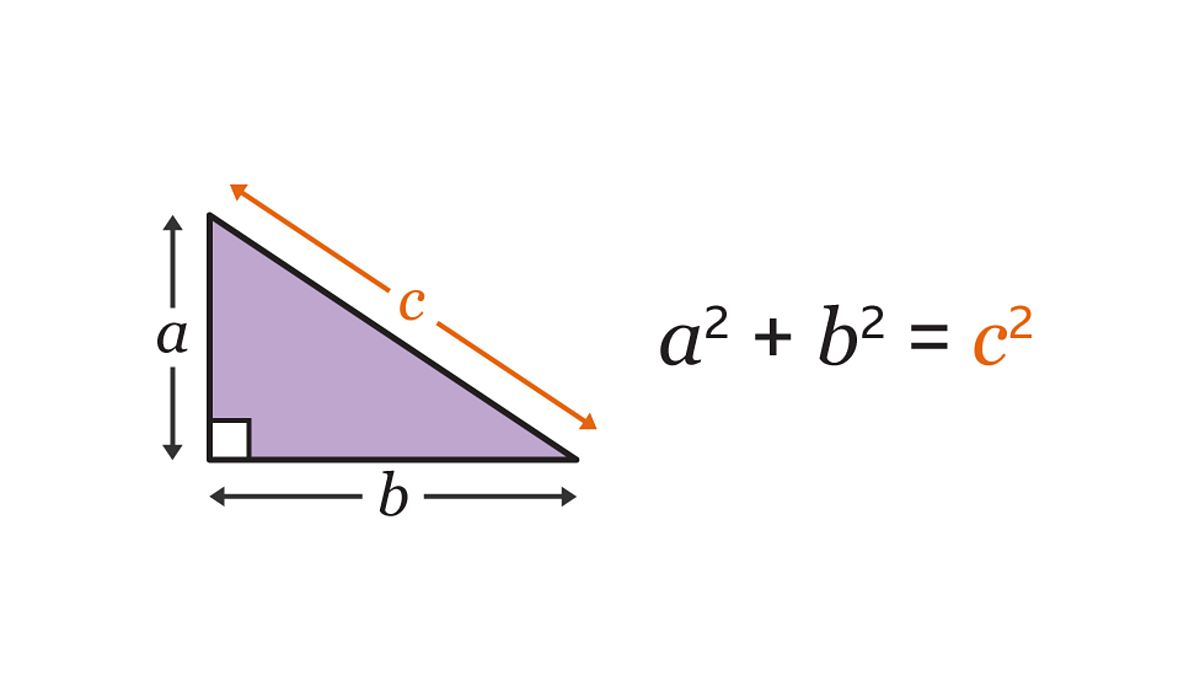
Euclidean Distance: Pythagorean Theorem
Recall that the pythagorean theorem gives you a relationship between the lengths of the sides and hypotenuse of a right triangle:
Find the hypotenuse of the right triangle with legs 2 and 4.
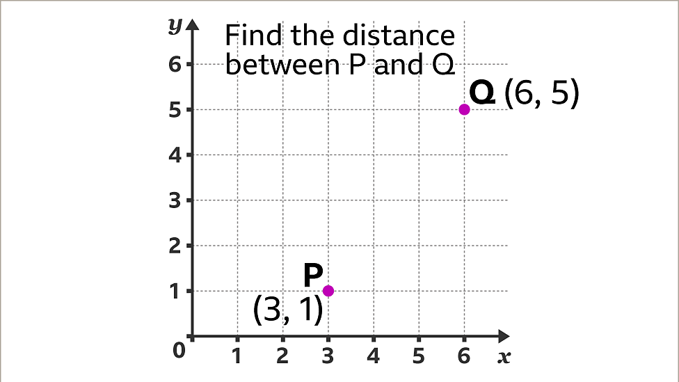
Euclidean distance is just a fancy term for the straight line distance between two points in space. Find the distance between points P and Q:
Market Segmentation Problem
- Simulate data where customers belong to two groups: people whose
spendingandpurchase_frequencyare relatively low, and people whose values are high for both those categories.
- Step 1: Assign initial clusters randomly.
# data <- data %>%
#   mutate(cluster_id = sample(1:2, size = ___, replace = T))

# data %>%
#   ggplot(aes(x = frequency, y = spending, color = as.factor(cluster_id))) +
# geom_point()- Step 2: Calculate the centroid of each cluster.
centroids <- function(dataset) {
  dataset %>%
    group_by(cluster_id) %>%
    summarize(f = mean(frequency), s = mean(spending))
}

# centroids(data)- Step 3: Assign each observation to the cluster whose centroid is closest.
# reassign_clusters <- function(dataset) {
#   centers <- centroids(dataset)
#
#   ___
# }

# data <- reassign_clusters(data)

# data %>%
#   ggplot(aes(x = frequency, y = spending, color = as.factor(cluster_id))) +
# geom_point()- Step 4: Iterate 5 times, drawing a plot each time to see the clustering improve.
# for (i in 1:5) {
#   ___
# }