library(tidyverse)1.7 R as a Graphing Calculator
stat_function() in ggplot2 allows us to visualize mathematical functions. We’ll use anonymous functions with it to create various types of plots.
First, attach the tidyverse to your current session (which includes ggplot2):
Then use theme_set() to set a ggplot2 theme for this document. theme_minimal() is a nice, minimalist alternative to the ggplot default. Try replacing theme_minimal() with:
- theme_bw() for a white background with gridlines, often used for publications.
- theme_dark() for a dark background with contrasting gridlines, suitable for presentations.
- theme_classic() for a minimalistic theme with only axis lines and no gridlines.
- theme_void() which removes all elements (axes, gridlines, background), ideal for maps or minimal visuals.
- theme_linedraw() for a clean, black-and-white theme with thin lines, designed for technical drawings.
theme_set(theme_minimal())Example: Plot the function \(y = 2x + 1\) in red:
ggplot() +
  stat_function(fun = function(x) 2 * x + 1, color = "red")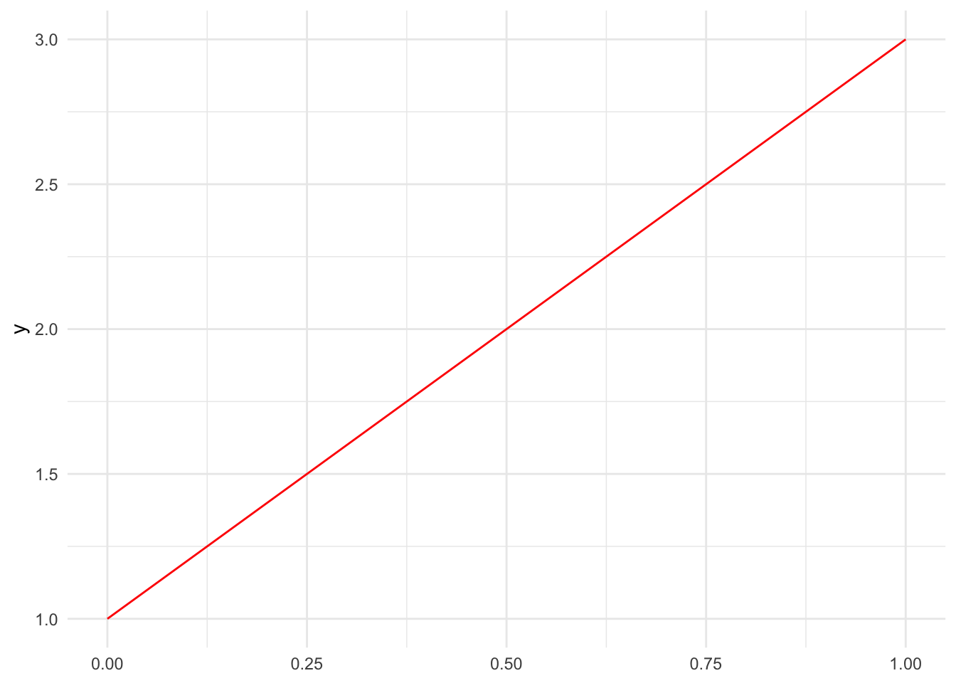
Notice that I used an anonymous function to define the line. The function takes x as input and returns 2 * x + 1 as output.
1) Plot the line y = -3x + 6 in blue.
Multiple functions can be plotted on the same graph by adding more stat_function() layers:
ggplot() +
  stat_function(fun = function(x) 2 * x + 1, color = "red") +
  stat_function(fun = function(x) -x + 3, color = "blue")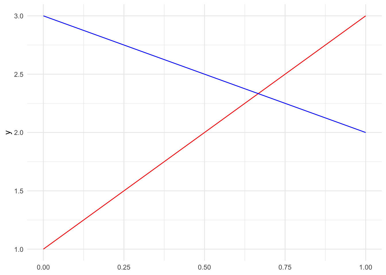
2) Create a plot showing three lines. Choose three different colors for your plot. You can see R’s color options by running the function colors(), or by visiting this site: https://r-charts.com/colors/
\[\begin{align} y &= 2x + 1\\ y &= -x + 3\\ y &= 0.5x - 1\\ \end{align}\]
Controlling the Viewing Window
Use xlim() and ylim() layers to zoom in or out, controlling what portions of the function you see:
ggplot() +
  stat_function(fun = function(x) 2 * x + 1, color = "red") +
  xlim(-5, 5) +
  ylim(-10, 10)
Warning: Removed 5 rows containing missing values or values outside the scale range
(`geom_function()`).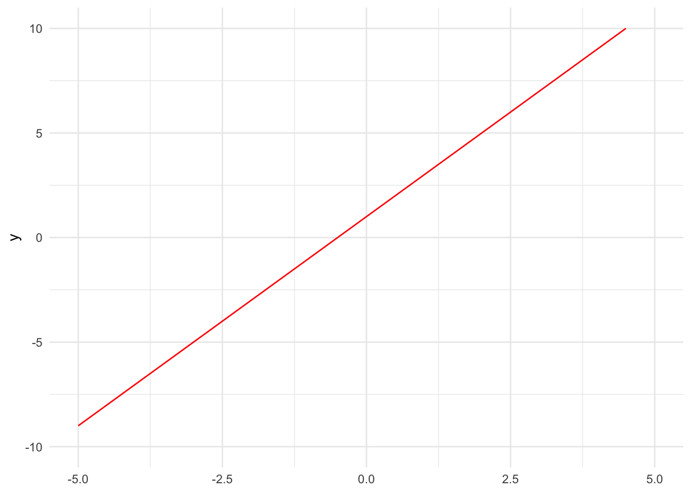
3) Plot \(y = x^2\) showing only x-values from -3 to 3 and y-values from 0 to 10.
Polynomial Functions
You can use stat_function to plot polynomials of any degree. Here are examples of constant, linear, quadratic, and cubic functions. I use aes() in sort of a hack-y way to color and label the lines by mapping line color to different character strings (there’s no data):
ggplot() +
  stat_function(fun = function(x) 3, aes(color = "constant")) +
  stat_function(fun = function(x) 3 * x, aes(color = "linear")) +
  stat_function(fun = function(x) 3 * x^2, aes(color = "quadratic")) +
  stat_function(fun = function(x) 3 * x^3, aes(color = "cubic")) +
  xlim(-2, 2)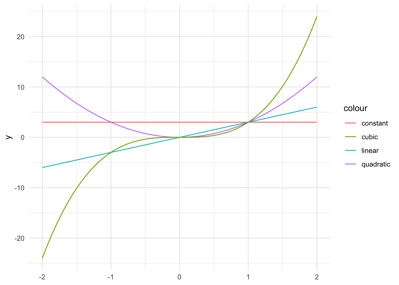
4) Plot these three quadratic functions:
\[\begin{align} y &= x^2\\ y &= x^2 + 2\\ y &= 2 x^2 \end{align}\]
Use different colors for each and set appropriate viewing windows.
Adding Plot Features
Add a title and axis labels to make your plots more informative using the labs() function:
ggplot() +
  stat_function(fun = function(x) x^2, color = "red") +
  xlim(-3, 3) +
  ylim(0, 10) +
  labs(title = "Quadratic Function",
       x = "x",
       y = "f(x)")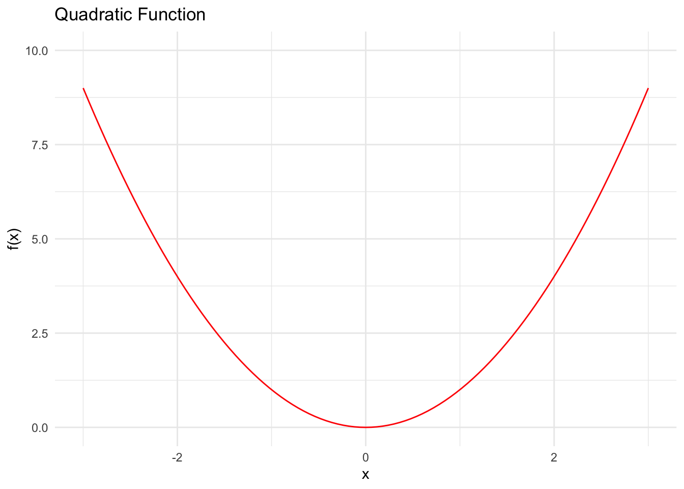
5) Plot a circle with radius 2 centered at the origin. Add a title and axis labels.
Hint: You’ll need to plot the upper and lower half separately using y = ± sqrt(4 - x^2). And to make the plot print to the document with the same height and width, use these chunk options: fig.width=6, fig.height=6